Nearpod
Introduction
The Problems:
Teachers find it time-consuming to organize their lessons.
Seeing a long list of lessons is overwhelming and takes effort to browse.
Collaboration in the current system is limited.
Project Summary:
Research to narrow the problem space -> Initial design -> Usability testing
Limited folder functionality resulted in users not being able to easily organize their content. The project goals were to improve the functionality of folders and allow schools and districts to use folders to map out the scope and sequence of their curricula.
Background:
Between 500-1,000 folders are created daily. Folders are a vital component of the Nearpod library and how teachers create order around their various lessons, activities, and videos. We know that teachers use their folders daily, and sadly, we also have heard there is a bit of a learning curve when starting out.
My Role:
UX Research, UX/UI Design
My Team:
Product Manager
UX Manager
Engineers
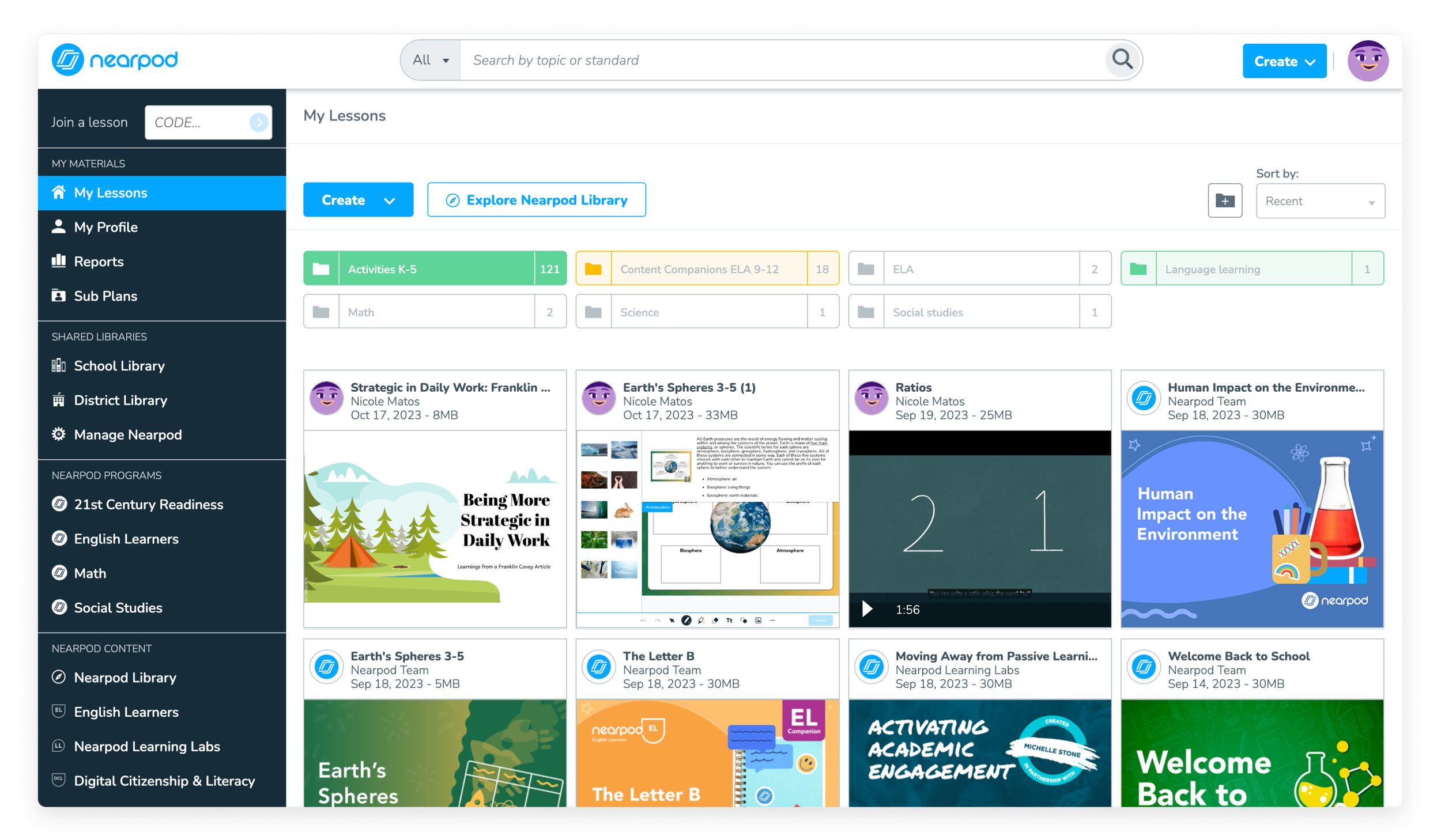
The Solution:
Enable bulk actions via multi-select,
Remove automatic navigation behavior,
Provide folder action menus from the main page,
Enable drag experience for more users, and
Improve the visualization of folder hierarchy in the “Move” modal.
Users can now move multiple lessons and folders at once, using either the new bulk action toolbar, or via drag-and-drop. This reduces the amount of time it takes teachers to keep their workspace tidy.
Other improvements included:
• Improving the feedback toasts to be provide an accurate summary of the action, as well as an “Undo” link
• Redesigned folder breadcrumbs to meet accessibility requirements, and the improve discoverability of folder action menu
• Modernized the lesson cards by softening the corner radius, and reducing the amount of buttons seen on hover
The Design Process
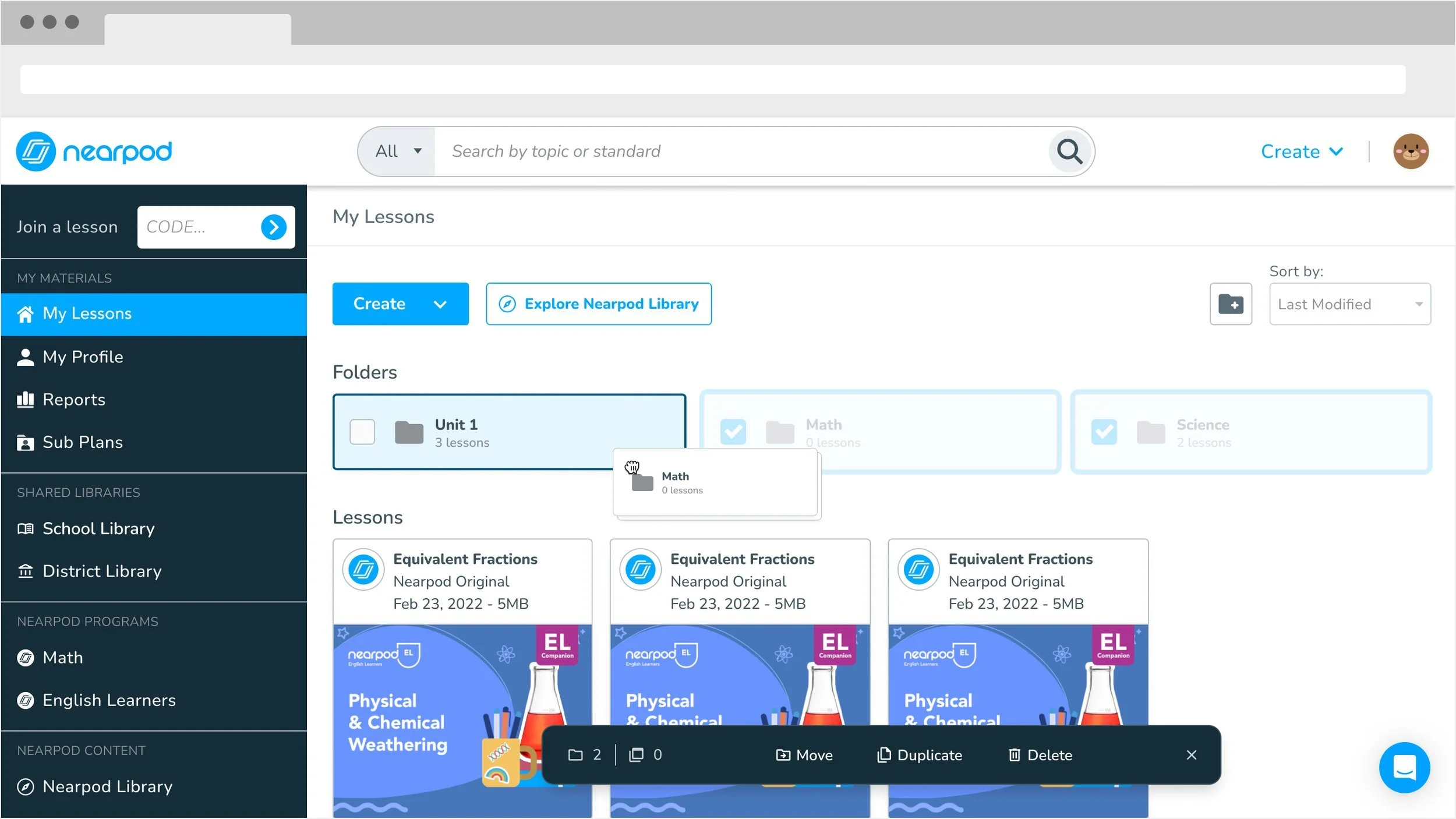
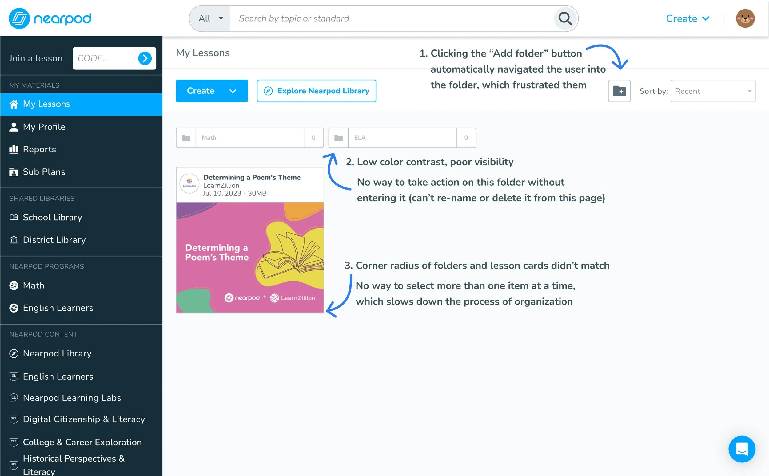
An audit of the current-state revealed a few issues, including poor contrast and unusual auto-navigation into new folders.
I started by auditing the current experience and taking notes of the issues. One obvious issue was poor color-contrast. Another was that after creating a new folder, the system automatically nagivated into that folder. This surprised me and I wondered whether people found that behavior helpful or not (spoiler: they didn’t!).
I made a list of the issues to ensure my redesign addressed all of them.
Issues with the previous design
Research
Previous state, before redesign
My secondary research taught me that teachers like to be able to color-code their folders.
I searched our product Facebook group and Canny feedback board for teacher’s comments related to folders and organization. Many users were requesting features we already had, like color tagging, which suggested poor discoverability in the current design.
I also watched recordings of teachers using their folders in Hotjar. I wanted to see how our users utilized folders, how many they typically have, etc. Most users had just a few, but some had so many that their whole page was filled with folders, and couldn’t see any lessons!
Current state usability testing revealed that users don’t like being automatically navigated into new folders, among other issues.
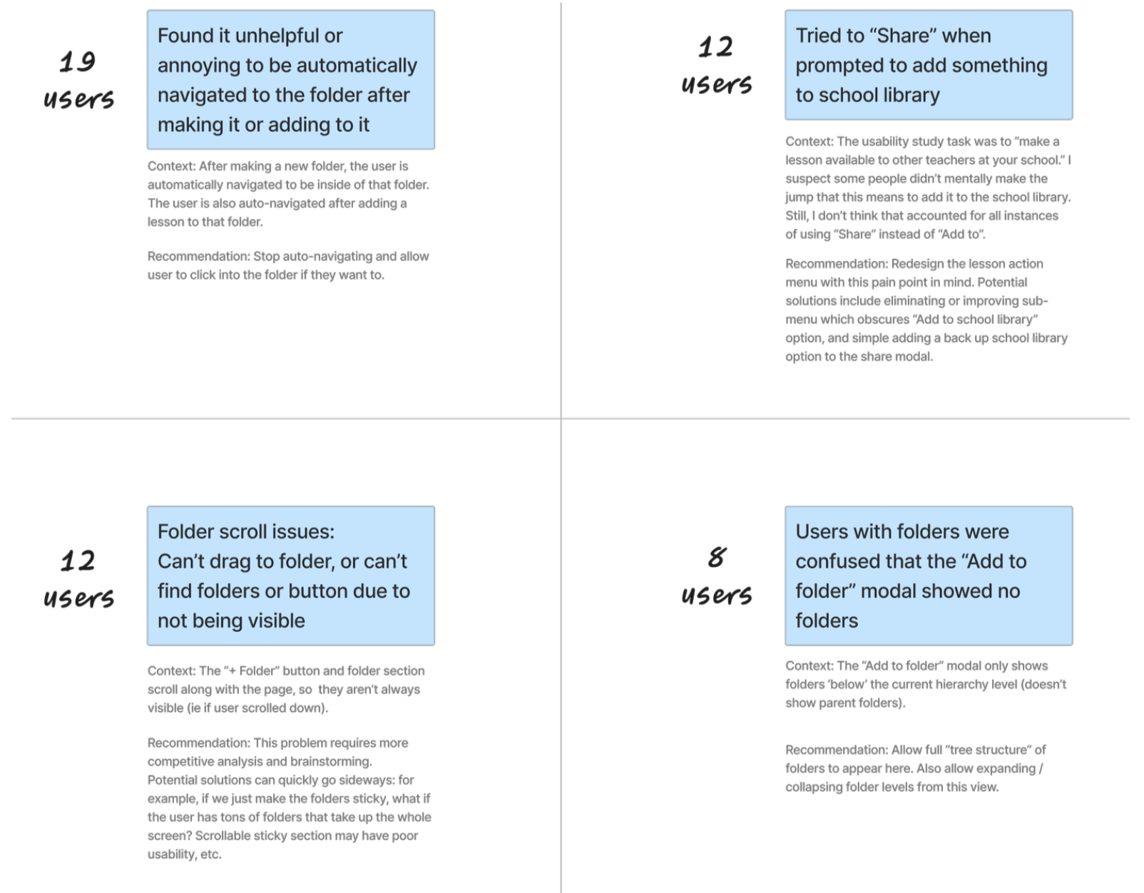
To understand what problems users faced, I conducted an in-product usability test with 21 people. I asked them to log in to a demo account, and arrange the lessons however they normally would. I found several problems, including the following main issues:
• It’s unhelpful or annoying to be automatically navigated to a folder after making it or adding lessons to it (19 users). “If I wanted to go to the folder, I would just click it!”
• Tried to “Share” when prompted to add something to school library (12 users)
• Folder scroll issues: Can’t drag to folder, or can’t find folders or button due to not being visible (12 users)
• Users with folders were confused that the “Add to folder” modal showed no folders (8 users)
Problem:
Users are frustrated when they are automatically navigated to the folder after creating it or adding to it.
Hypothesis:
If we stop automatically navigating the user into the folders, then users will find it easier and more efficient to create folders.
Success metrics:
Rate of folder creation will increase.
Problem:
Users are not able to add their lessons to parent folders via the “Add to folder” menu, despite the folders being present.
Hypothesis:
If we make the “Add to folder” modal comprehensive, then the time it takes users to rearrange their lesson organization will decrease.
I considered a secondary side-panel for folders, but given redesigning our current navigation was out of scope, having two side bars would utilize too much precious screen real estate.